23 Design Fails That Meant Well But Something Went Wrong
Nathan Johnson
Published
04/10/2018
in
wtf
design “solutions” that will make most of us cringe
- List View
- Player View
- Grid View
Advertisement
-
1.
-
2.
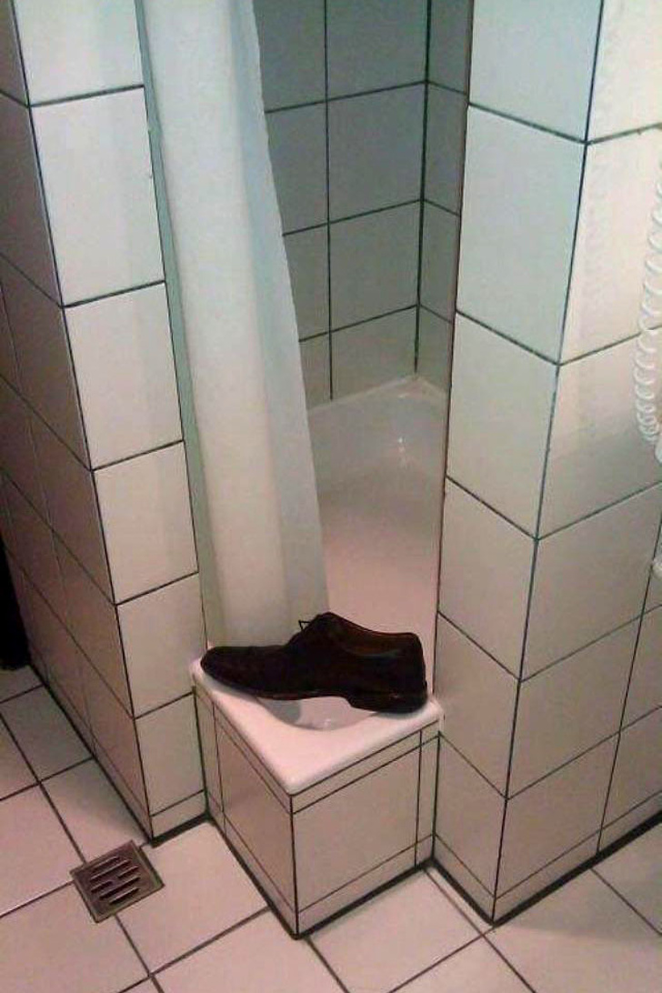 How about the width of this shower entrance?
 -
3.
-
4.
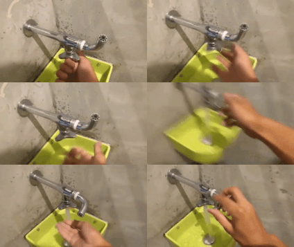 The most confusing faucet
 -
5.
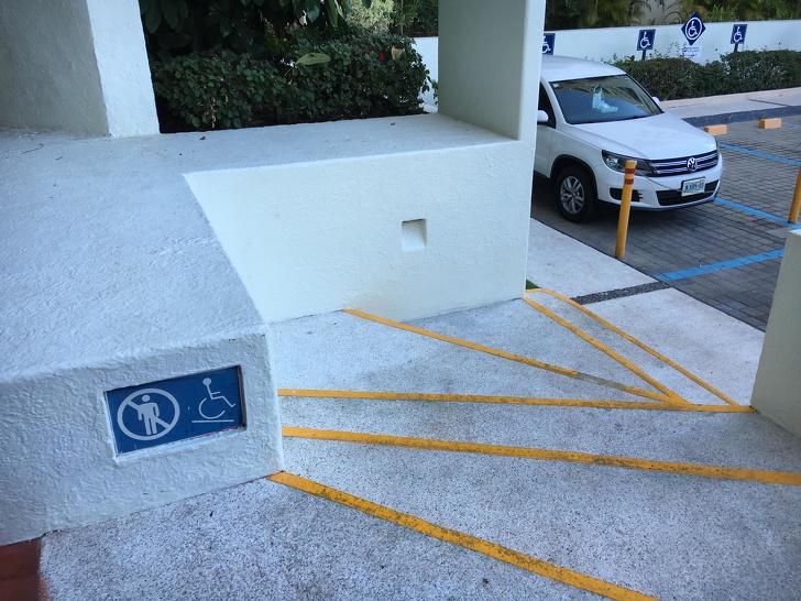 Extreme wheelchairing
 -
6.
-
7.
 A criminal that the Warwickshire police tried to find.
 -
8.
-
9.

-
10.
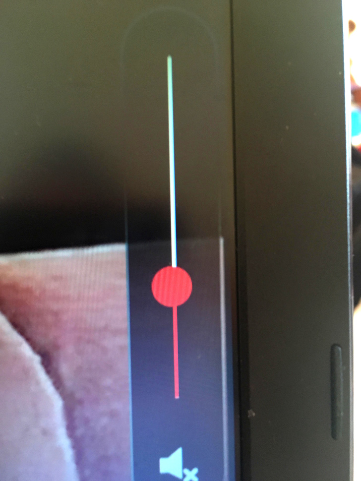 The circle on this volume control isn’t centered on the line.
 -
11.
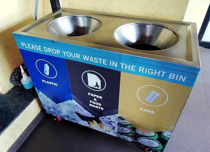 Where do I throw away my food?
 -
12.
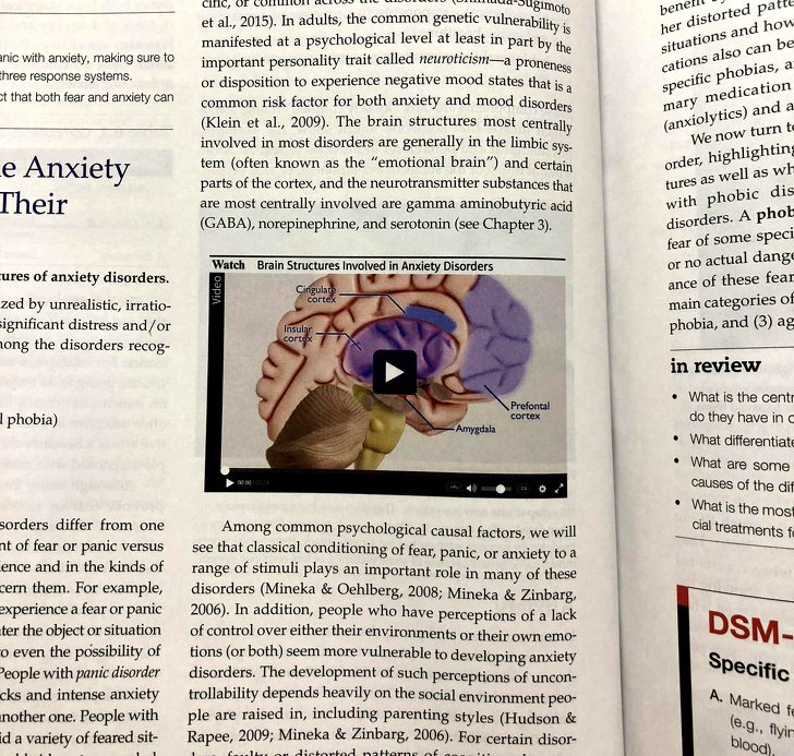 “My textbook has a video for me to watch.”
 -
13.
 Why did they need to photoshop a trashcan?
 -
14.
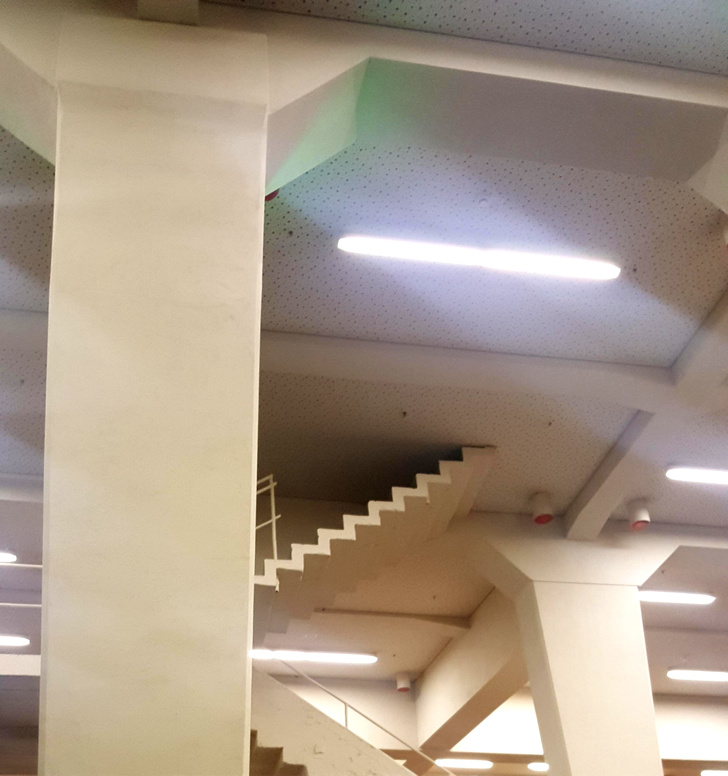 Stairs to the ceiling
 -
15.
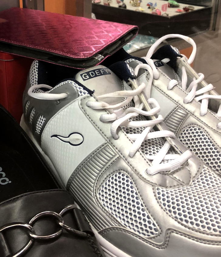 Very strange logo
 -
16.
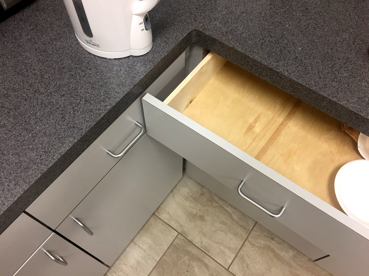 “Neither drawer can open completely.”
 -
17.
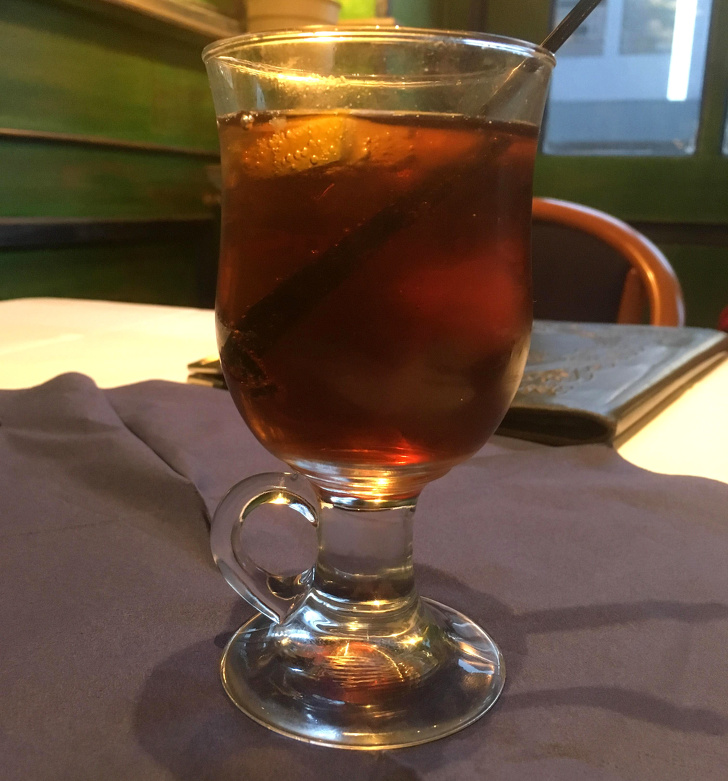 Where is the handle?
 -
18.
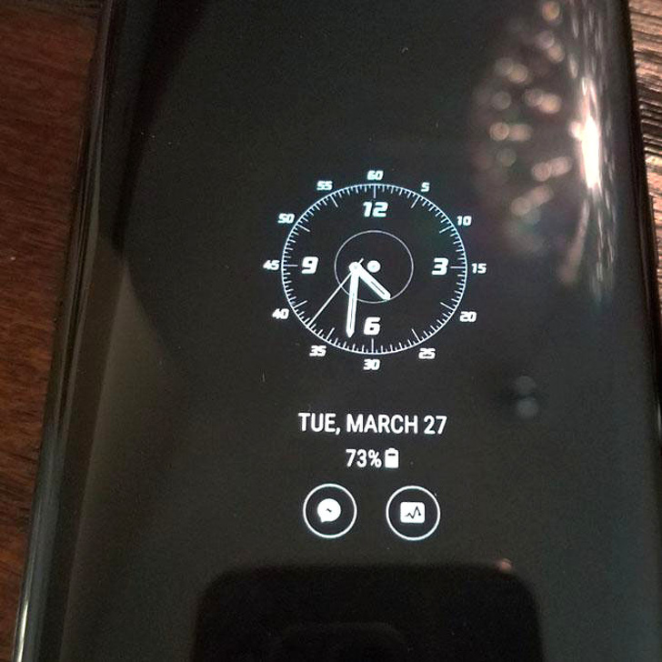 What’s the time? 4:30 or 4:33?
 -
19.

-
20.
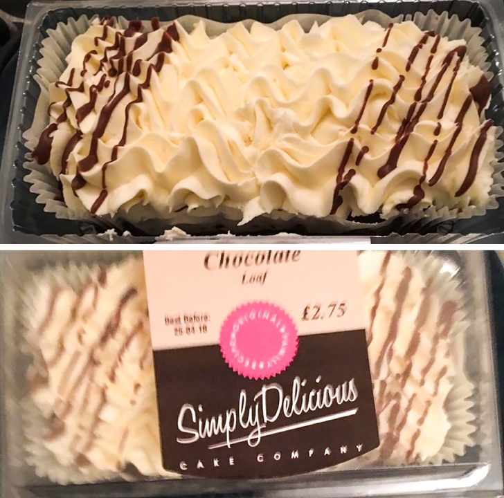 “The old packaging trick.”
 -
21.
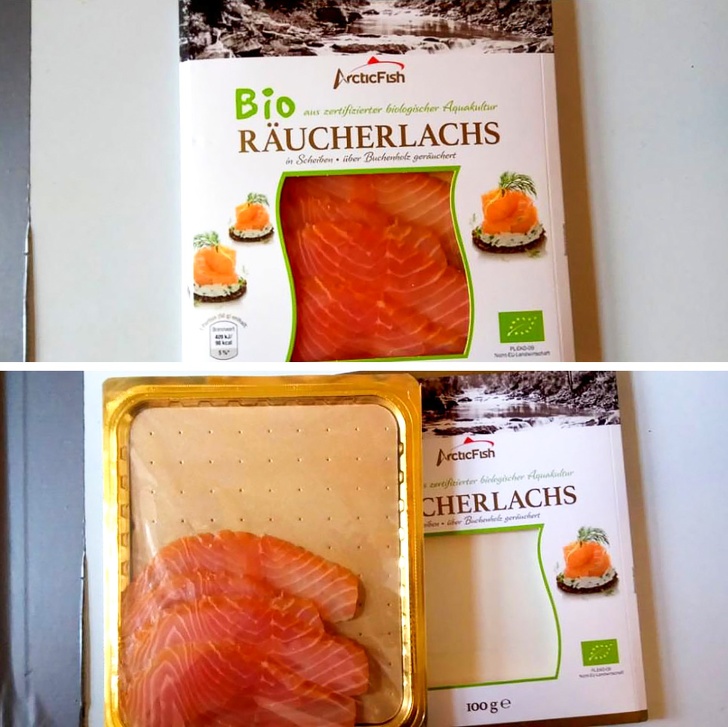 “Big packaging for 4 small pieces.”
 -
22.
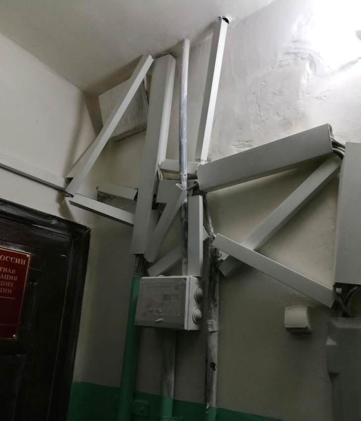
-
23.
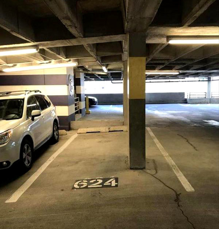 Here’s the only parking spot that’s not taken.
- REPLAY GALLERY
-
- 23 Design Fails That Meant Well But Something Went Wrong
- NEXT GALLERY
-

- Legend of the SAND DOLLAR
23/23
1/23
Categories:
Wtf




0 Comments