28 Designs That Are Horrible
Nathan Johnson
Published
08/17/2020
in
wtf
Who thought this was a good idea? Sometimes it best to ask for a second opinion on a job "well done," because these people know from first hand, what happens when you don't do something right the first time.
- List View
- Player View
- Grid View
Advertisement
-
1.
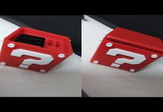
 “When I put game cards in my game card case it can’t be closed anymore.”
 -
2.
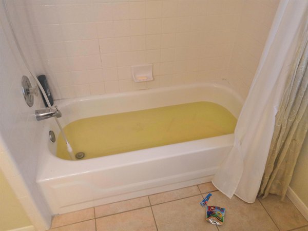 “My Mario themed bath bomb makes it look like I’m bathing in piss.”
 -
3.
-
4.
-
5.
-
6.
-
7.
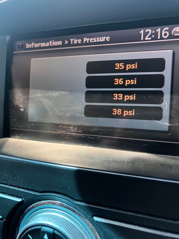 “The display doesn’t indicate which tire is which. And according to the manual the numbers are displayed randomly each time you drive.”
 -
8.
-
9.
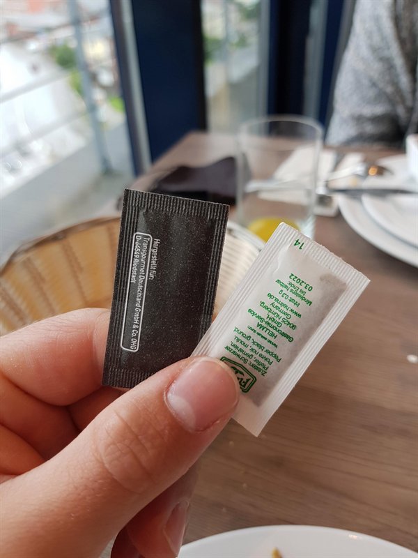 The black one is salt, the white one is pepper.
 -
10.
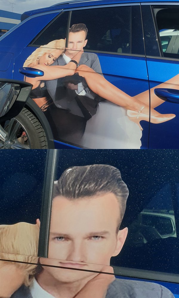
-
11.
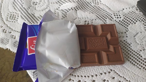 This chocolate you can’t properly break.
 -
12.
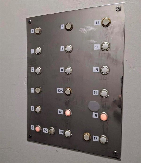
-
13.
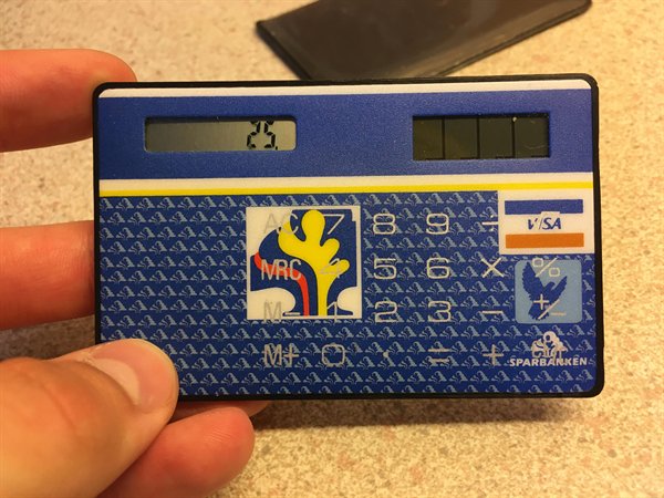 ”Let’s put the logos behind the buttons”
 -
14.
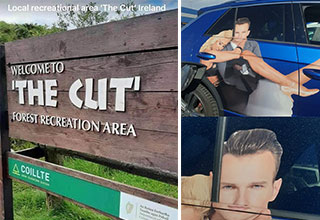
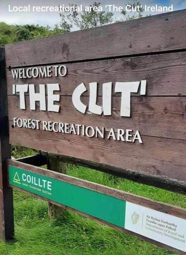 Welcome to “The Cut” Forest Recreation Area.
 -
15.
-
16.
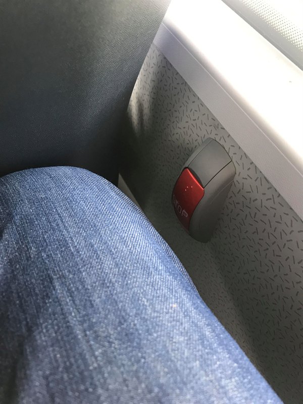 “I accidentally pressed the stop button on the bus several times because it’s the same height as my leg..”
 -
17.
-
18.
-
19.
-
20.
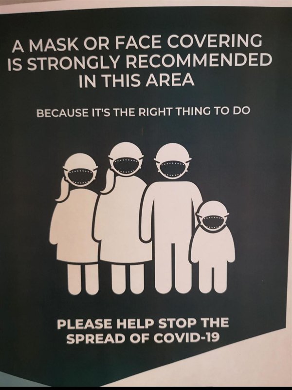 The people wearing masks look like monsters in this.
 -
21.
-
22.
-
23.
-
24.
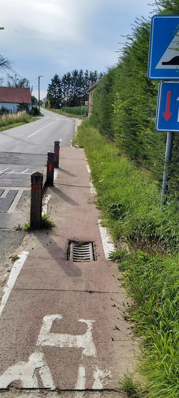 Bike lane in Belgium.
 -
25.
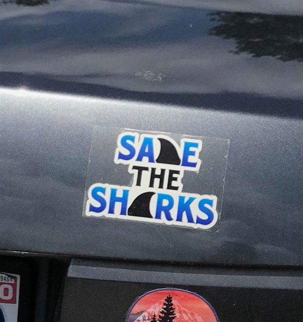 “Why not just make the fin the A in both words?”
 -
26.
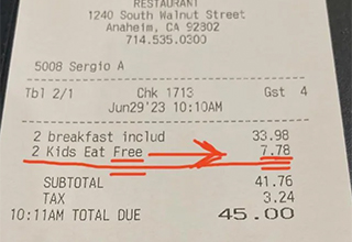
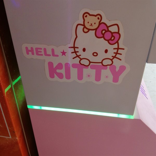 Great for kids!
 -
27.
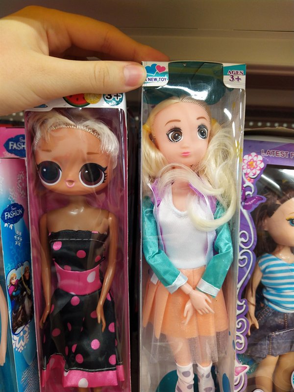
-
28.
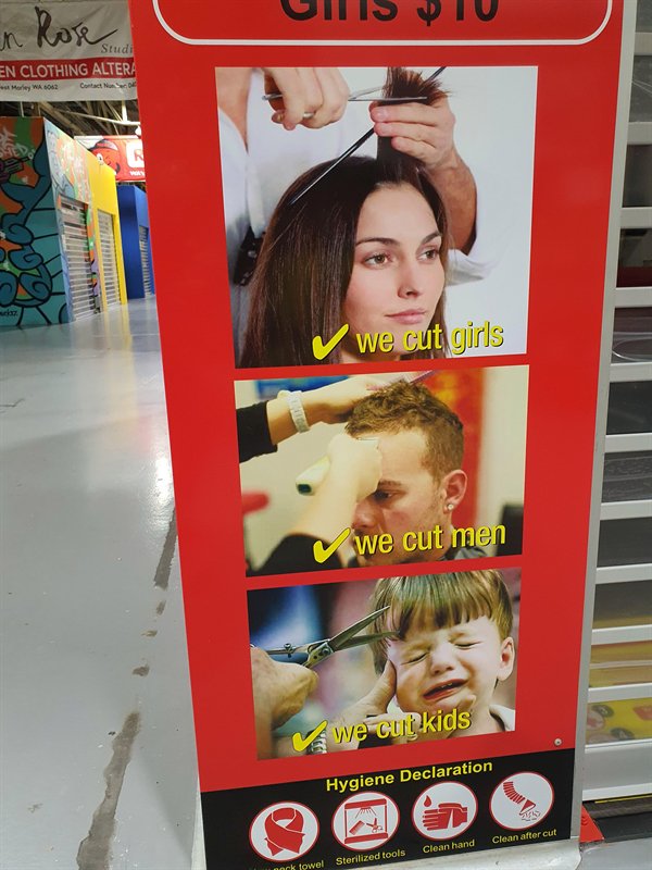
- NEXT GALLERY
-
- Last Minute Pics to Keep The Weekend Going
“When I put game cards in my game card case it can’t be closed anymore.”
28/28
1/28
Categories:
Wtf



3 Comments